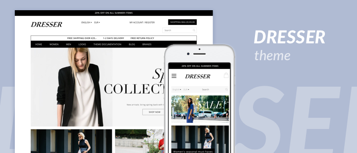
The Dresser is a responsive theme specifically designed for clothing and fashion accessories webshops. This contemporary theme follows minimalist design trends, offers several unique features aimed to deliver an enhanced shopping experience to your visitors and helps merchants to create a brand community with features such as "Shop the Look" and Instagram feed integration. This way the merchant can focus on retention and repeated purchases due to the unique customer experience in the webshop.
Access your settings by navigating to the "Design" section of your backoffice (this section can be found from the "Dashboard", in the sidebar on the left of your screen) and then clicking on the button that says "Theme Settings" in the center of your screen. The next page contains an overview of every available theme setting, these settings affect the looks of your theme and can be adjusted to your liking at any time.
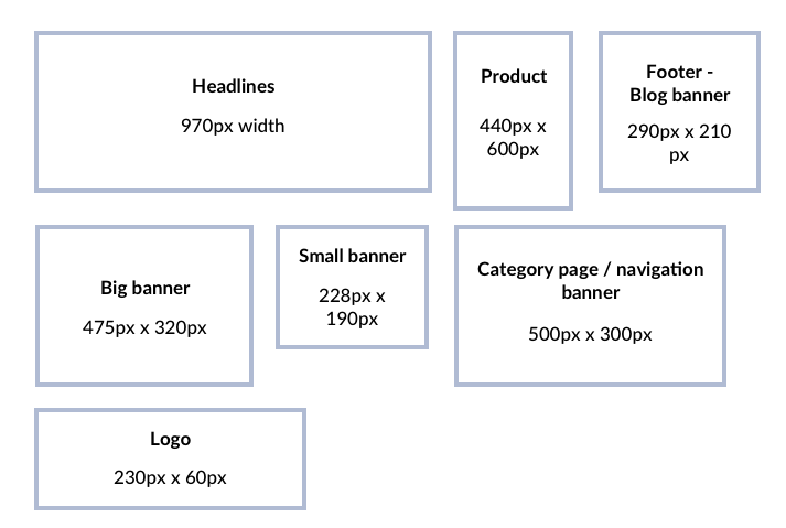
Logo: This is your webshop's logo, displayed at the top-left corner of every page on your webshop. Recommended dimensions: 230px x 60px (width x height) where 400px x 300px (width x height) are the maximum dimensions.
Favicon: This is the small icon displayed in the tabs of your users' browsers. Recommended dimensions: 16px x 16px.
Retina logo: Activate this setting if you wish to use a retina version of the logo.
Retina logo: Upload a retina version of the logo.
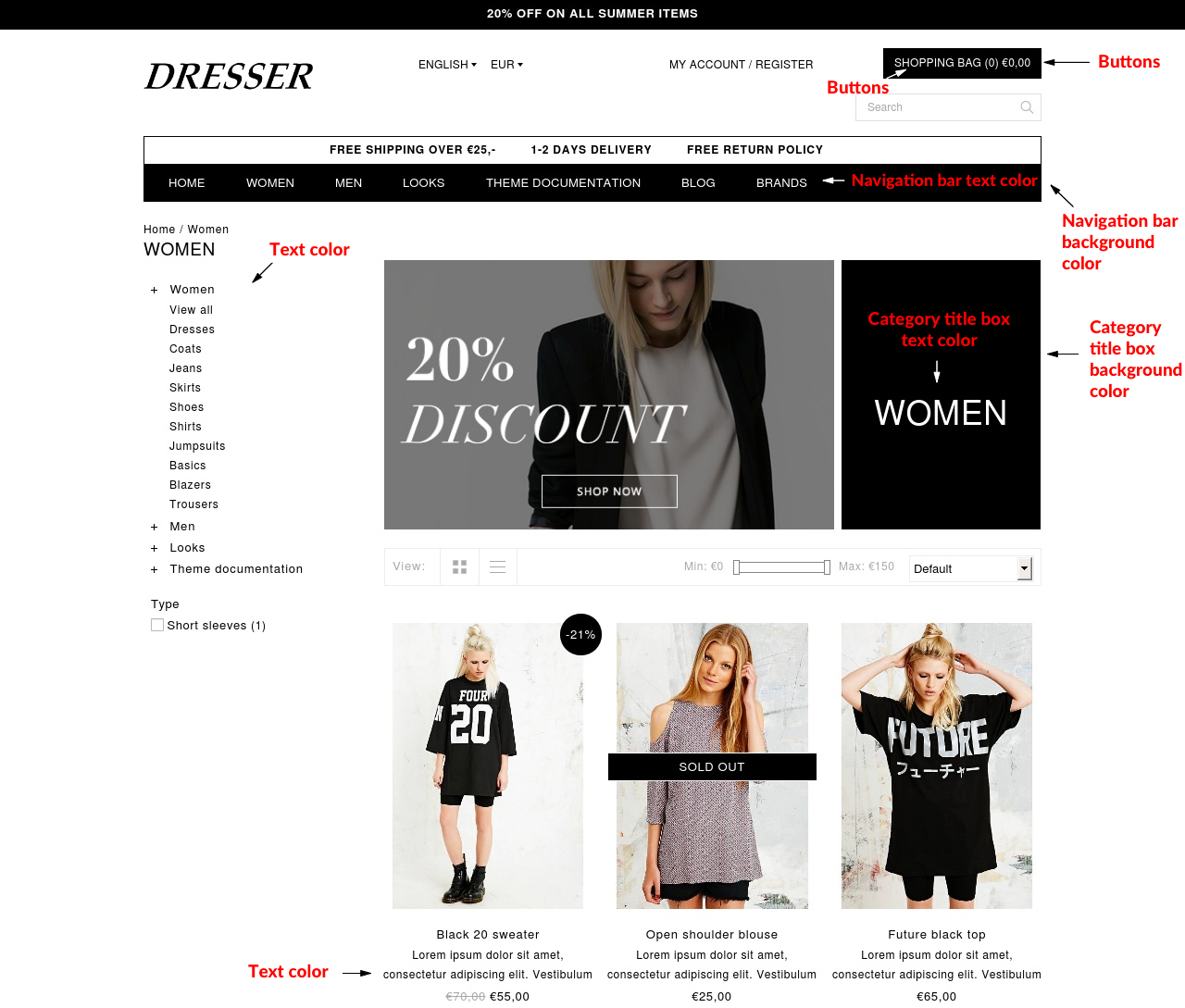
Navigation bar background color: Change the background color of the navigation bar here.
Navigation bar text color: Choose here for the color for the text.
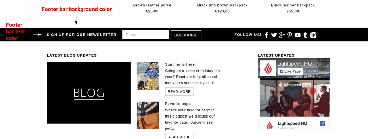
Footer bar background color: Choose a background color for the footer bar here.
Footer bar text color: Choose here for the color for the text.
Category title box background color: Choose a background color for the category title box in the category page.
Category title box text color: Choose here for the color for the text.
Text color: Choose here for the color of the text of your store.
Buttons: Choose here for the color of the text in the buttons.
Buttons: Choose a background color for buttons here.
Scale category & brand images to fit: Activate the scaling of category & brand images here.
Scale NEW products images to fit: Activate the scaling of NEW product images here.
Scale products to fit: Activate the scaling of products here.
Scale product image on the product page so it fits: Activate the scaling of the product images on the product page here.
Background image: Upload a background image for your webshop.
Background position: Uploaded background position.
Background repeat: The way the background is repeated.
Background color: Edit the container body content background color.
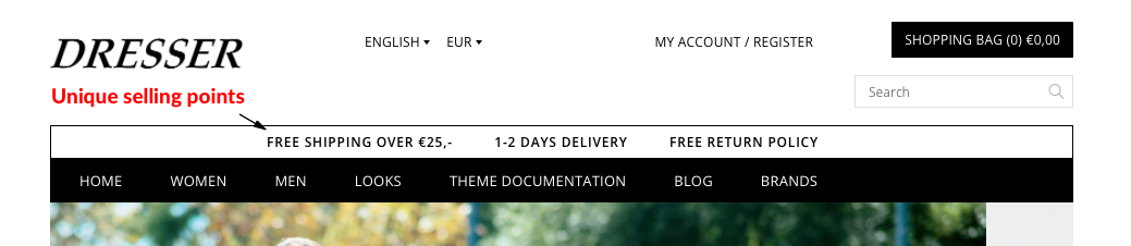
The Dresser theme offers the possibility to showcase 'unique selling points' within your online store, the right words can convince your customers and increase conversion. You can add up to 6 USP's. If multiple languages are installed a custom translation needs to be added for every USP ("Content > Translations > Add Custom Translation"), you can create a custom translation for each USP by using the USP text as a translation key. More information on custom translations is available through our help center documents.
Activate: Click here to activate or deactivate the Unique Selling Points.
Unique Selling Points 1: Add the text for a Unique Selling point here.
Unique Selling Point 2: Add the text for a Unique Selling point here.
Unique Selling Point 3: Add the text for a Unique Selling point here.
Unique Selling Point 4: Add the text for a Unique Selling point here.
Unique Selling Point 5: Add the text for a Unique Selling point here.
Unique Selling Point 6: Add the text for a Unique Selling point here.
Color Text: Choose here for the color for the text.
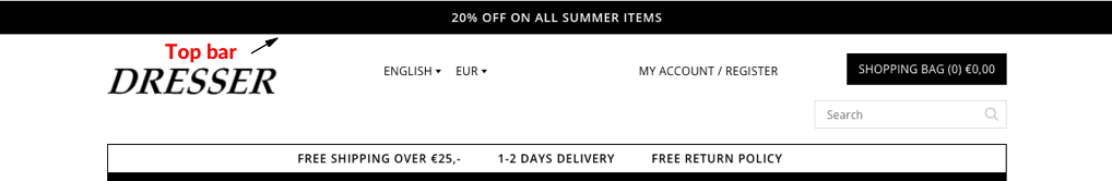
Within the top bar, you can promote anything you like. For example a sale, new collection or any other news you want to share.
If your online store is using multiple languages, you'll need to add the texts as a translation. More information on custom translations is available through our help center documents.
Activate: Here you can activate or deactivate the bar at the top of your webshop. In this top bar, you can make people aware of an offer, for example. See themes for examples.
Text in the offer top bar: Add the text for the offer topbar here.
Background color: Choose a background color for the text in the message topbar.
Text color: Choose here for the color for the text.
Google webfonts: Pick the font for your webshop.
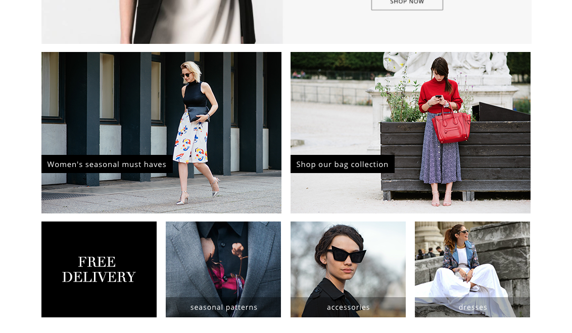
Activate: Activate or deactivate the big banners underneath the headlines here.
URL of the banner: Add the URL of the page where the banner links to.
Banner image: Upload image for this banner.
Activate: Activate or deactivate the text in the banner here.
Text color: Choose here for the color for the text.
Background color text: Choose a background color for the text in the banner.
Activate: Activate or deactivate the small banners here.
URL of the banner: Add the URL of the page where the banner links to.
Banner image: Upload image for this banner.
Activate: Activate or deactivate the text in the banner here.
Text color: Choose here for the color for the text.
URL of the banner: Add the URL of the page where the banner links to.
Banner image: Upload image for this banner.
Activate: Activate or deactivate the text in the banner here.
Text color: Choose here for the color for the text.
URL of the banner: Add the URL of the page where the banner links to.
Banner image: Upload image for this banner.
Activate: Activate or deactivate the text in the banner here.
Text color: Choose here for the color for the text.
URL of the banner: Add the URL of the page where the banner links to.
Banner image: Upload image for this banner.
Activate: Activate or deactivate the text in the banner here.
Text color: Choose here for the color for the text.
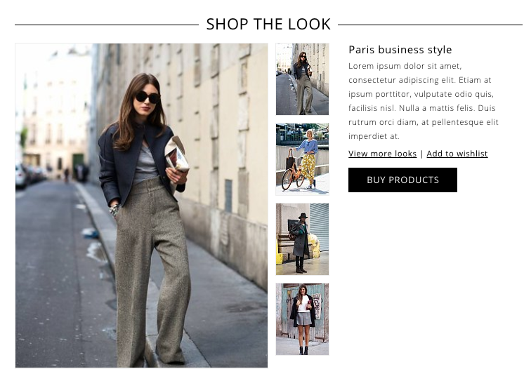
Shop the look: Activate "shop the look" on the homepage here.
Link to more looks: Add the link to the category page with more looks here.
"Shop the look" is a shopping featured aimed to improve shopping that makes it possible for customers to buy products that match a certain look. "Shop the look" uses the featured products functionality of the webshop, if "Shop the look" is enabled the featured products functionality can't be used alongside it. Please disable "Shop the look" to use the featured products functionality instead.
To use this feature some steps are required in order to set it up correctly:
Step 1: Activate template data:
Step 2: Create a product:
Important: Make sure the keyword 'look' doesn't contain capital letters or spacing.
Step 3: Add products to the look:
Step 4: Showing the looks on your homepage
Products not visible?: Make sure "Shop the look" is enabled! Navigate to Design > Theme editor > Customise theme and scroll down until you've reached: SHOP THE LOOK, enable it if it was disabled and save the settings by on 'Save' in the upper right corner of the page.
Extra: If you've created a category page with multiple looks, you can add the link to that page in the text field.
Banner: Activate the banner here.
Banner link: Add the URL of the page where the banner links to.
Banner image: Upload image for this banner.
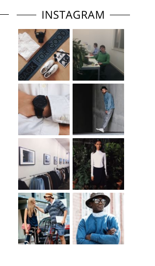
The Instagram feed functionality offers the possibility to inspire your customers with pictures from your own Instagram feed.
Showcase pictures of your own feed (Instagram feed / Option 1)
Filter with a certain hashtag (Instagram feed / Option 2)
Optionally, you can filter your feed based on a specific tag, to enable filtering:
Activate: Activate or deactivate the Instagram feed here.
Sort by: DESCRIPTION_MISSING
Instagram client ID: Read the theme manual to find out how to find your Instagram clientId.
Profile: Show images from your own profile.
Access token: Add your access token ONLY if you want to show your profile pictures and not if you want to show pictures by hashtag.
User ID: If you have chosen to show images from your profile, enter your user ID here. Read the manual to learn about how to find your user ID. Leave this empty if you have chosen a hashtag.
Tagged: Only display images from your feed with a specific tag.
Tagname: Tag to filter your feed on.
Facebook: Add your Facebook URL to display the Facebook icon in the footer.
Twitter: Add your Twitter URL to display the Twitter icon in the footer.
Google+: Add your Google+ URL to display the Google+ icon in the footer.
Pinterest: Add your Pinterest URL to display the Pinterest icon in the footer.
Youtube: Add your YouTube URL to display the YouTube icon in the footer.
Tumblr: Add your Tumblr URL to display the Tumblr icon in the footer.
Instagram: Url of your Instagram Profile.
Blog and Social Media feed updates: Activate the blog and social media feed updates in the footer here.
Facebook feed: Activate the Facebook feed widget here.
Facebook page name: Add the name for your Facebook page here.
Pinterest feed: Activate the Pinterest feed widget here.
Pinterest profile name: Add your Pinterest profile name here.
Show the company name: Enable this setting to display the name of your company in the footer.
Show description: Enable this setting to display a short description of your company in the footer.
Company name: Add your company's name here.
Description: Add a short description here.
Show phone number: Enable this setting to display the public phone number of your company in the footer.
Phone number: Add your company's public phone number here.
Show email: Enable this setting to display the public email address of your company in the footer.
Email: Add your company's public email address number here.
Blog banner image: Upload image for this banner.
Show featured products on the homepage: By default, the theme will display featured products if "Shop the look" is disabled. Disable this setting to hide featured products on the homepage.
Show featured categories on the homepage: Disable this option to hide featured categories on your homepage.
Brands: By activating this button, the brands will be shown in the navigation.
Reviews: Displays reviews.
Newsletter: Displays the newsletter in the footer.
Tags homepage: Displays tags on the homepage.
Kiyoh: Enter Shop id to activate widget (use translations for multilingual).
Feedbackcompany ID: Enter Shop id to activate widget (use translations for multilingual).
Display brand name next to product name: Displays brand name next to product name in the catalog and homepage if activated.
Show discount: Show the discount percentage of the products in the collection page.
Show sold out: Show 'Sold out' message on products in the collection page (only works on default variant).